


Mobile Optimised Websites (And Why They Matter)
You’ve most likely heard that your smartphone is more powerful than the computers that first sent men to the Moon. In fact, just the clock feature alone processes data millions of times faster than the Apollo era computers, which makes you wonder how Neil Armstrong and his chums managed to get further than NASA’s car park.
Whenever you use your phone or tablet, whether it’s to send an email, pay a bill, do a bit of shopping or get your TikTok fix, you’re using an incredibly powerful piece of technology. As such, every website needs to be designed with smartphones in mind, as they currently account for just over 50% of all global web traffic and this figure is constantly rising. If your website isn’t optimised for mobile, you’re guaranteed to be losing potential customers without even knowing it.
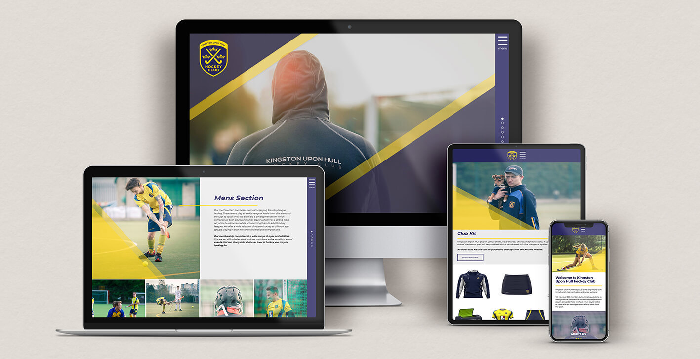
Designed for all screens sizes
When you choose It’seeze Hull for a new website, you’re getting a professional web development team that knows how to design for both traditional desktop sessions and also the mobile experience.
Mobile and tablet optimisation needs to be incorporated into the design process from the very start, as chucking it in as an afterthought will seriously affect the way the site performs on smartphones. Attention to detail makes all the difference, so you can rest assured that your site receives the focus and expertise that it deserves.
Improve your visitor engagement
A website that’s designed primarily for desktops will look plain old rubbish on a mobile. As a result, the user is very unlikely to follow a call to action, which is a crucial part of the digital exchange.
Calls to action give the viewer more value from their visit and simultaneously increase engagement, such as inviting them to book a free website audit or download a quick guide to website security.
When users engage with your website for longer and on a deeper level, the more they connect with your brand and understand what you can offer them.
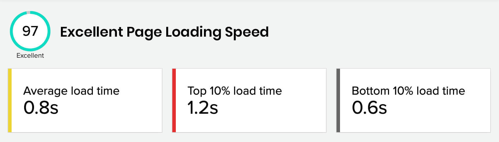
The need for speed
We Brits are still pretty good at standing in a queue at the post office but we simply won’t tolerate a slow-loading website, which is why mobile optimised sites are built around speed as well as quality. The result is fast and stress-free delivery regardless of the user’s device, operating system and chosen browser.
Don’t forget the SEO
Search engine optimisation, or SEO, is what either puts your business on the first page of Google or keeps it far away. On top of the web design itself, there are so many factors that go into achieving strong levels of SEO, such as:
• An up-to-date Google My Business account
• Powerful web copy that’s unique and grabs attention
• Video content that increases the average time spent on the site
• A regularly updated blog or news section
• Backlinks from reputable websites
• Social media integration
• And much more (we’ll look at SEO again in a future blog post)
As if perfecting SEO wasn’t a mammoth task in the first place, Google now takes into account your website’s mobile SEO as a separate factor. In other words, if you have a website that works beautifully on a desktop but not that well on smaller devices, the low levels of mobile SEO will be detrimental to your overall search rankings.
The solution is a website that’s designed just as much around the mobile experience as larger screens, ensuring smooth performance on any device.
Let’s talk
The team here at It’seeze Websites Hull & East Yorkshire can help your business to get more out of mobile traffic. Give us a call on 01482 880929 or fill in our contact form and let’s talk mobile optimised web design.
Share this post: